Sunday, June 26, 2016

Project and Portfolio II: 3-D Animation

The Assignment

My academic shuffle into a new class this month led to 4 weeks of a highly engaging process. In 3DA2, I was able to take a given rig and manipulate it in the environment of my choosing. To set the scene, here are the assets I was provided with:


I was incredibly excited to push my skills in animation, all I had to do was fulfill a few simple requirements. First of all, the character had to take four steps. Secondly, at least one action must occur before or after those steps. Otherwise, it was completely open ended! I immediately focused on the ladder in the scene, deciding I wanted my character to climb down.


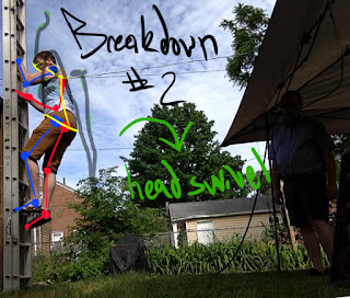
I filmed myself descending a ladder as a study in movement mechanics and used this as a reference in my animation. I posed my character according to my breakdowns and proceeded with the rest of my animation. Here is the final result:


My Reflection

Right off the bat, seeing the final animation gives me mixed feelings. I'm incredibly pleased to see the idea in my head brought to life! At the same time, I also know there are a million things I could do differently. For now, I'm happy that I now have a better understanding of motion as it's applied to the principles of animation. Once I started working in the graph editor and was able to identify cycles, it became fairly easy to create new poses. Unfortunately, I kept tweaking so many different parts that my timeline is almost solid red with keys.

I think that shows my level of engagement, I was so intent on making every little movement better that I lost myself in the details. If I could do it again, I'd stick to a simple block-out all the way through. I started complicating things by jumping around the timeline. Additionally, there are a few poses that I'd like to tweak and some timing that I'd fix. For example, Having a black fist shaking in front of a black background doesn't read that well. Also, it would have been easier for the viewer to read the "button push" if I added a bit of anticipation in there, isolating and slowing the action down.

What really stuck out for me as an integral pose/moment was the jump. I started by having a lot of issues on the timing. One thing we learned early on is to tweak the tangents of your Translate-Y so that the actual arc reflects how gravity acts on a body. I did that, but hadn't realized how long my character was in the air. I never translated frames to seconds until my first playblast. Thanks to some instructor feedback, I also realized that the character's rotation wasn't conducive to the movement I had blocked in. I used this insight to let the back foot drag, opening up the hips and making the pose look as if the character was propelling himself off of the ladder. I cleaned up the timing on the arc in the graph editor and was very pleased with the result. I did, however, have to adjust the rotation of the hips in the following keys to prevent popping. 

If there's one thing I've learned from the playblast-critique process of animating, it's that other people are able to point out why something isn't working if you can't see it. I found it very helpful to show my animation to everyone, as the more critiques I received, the more I was able to adjust my piece. Again, I know that it's not perfect right now, and I attribute that to my over-use of keys, but at least I know I have the capacity for creation.

Industry Connection

One assignment in this course asked us to create a Burn List for skills needed to land a job in the industry. We were tasked with picking a career that our major supports, and I found myself torn. I enjoy both modeling and animating. I hadn't been able to make a decision, and even now find myself wondering what I'd rather do.

Part of the reason I got into game arts was to be involved in creating assets that can be mapped into our world thanks to the advent of Augmented Reality. I wanted to be able to create worlds and movement and VFX to really make everything come alive! However, that's a lot to do, and definitely wouldn't fall under a singular job heading. It takes a team to create an immersive world. As much as I love the idea of animating and creating VFX, I realize that I'd find it more satisfying actually creating the assets. That being said, I plan on refining these skills so I can play with them on personal projects (and make myself more marketable, of course).

Monday, December 21, 2015

How to Create a Custom Alpha in ZBrush

Alphas can have a dramatic impact on the surface of your high-poly models, which is why so many are available for download on Pixologic and from other artists. As you get more comfortable with ZBrush, you may find that the given alphas are somewhat limiting, or not quite what you wanted. If you've ever found yourself wanting a greater degree of control over alphas, you'll be pleased to learn that you can create your own custom alphas in minutes!

Basic Overview

We will create a new document, sculpt on top of a simple plane, export the resulting geometry as an alpha, and apply it to a model. Keep in mind, this is for ZBrush 4R7 (sorry, future students!).

Setting Up Your Document

To begin with, open ZBrush select the Document menu. About halfway down, you should see options like the image below:


De-select the "Pro" option on the left and create a square document by entering a value into the Width and Height sliders, then click "Resize." The next step is to bring geometry into our document, giving us something to sculpt on.

Create a Plane3D

To create a Plane 3D, click on the fancy yellow S in the top right corner (your Tool menu), and select "3DPlane" as shown in the image below. 
Like any other tool, you'll have to draw the tool into your document. Place your pen on your tablet and move outward (holding shift to keep the plane snapped to an axis). After lifting your pen, you'll have to press T on your keyboard to make changes to the tool you just added.

Make sure that your plane fits the canvas by using the Zoom feature on the right side of your canvas (if you're using the custom install provided by FullSail). After adjusting the zoom, press F on your keyboard to frame the plane in full view. Before we proceed, you'll want to go up to the tool menu and click "Make PolyMesh3D."

Subdividing Your Plane

Remember, alphas are applied to high-res topology, so you'll want to subdivide this model 5-6 times before you start sculpting. To do that, select your Geometry sub-menu beneath your tools menu.
You'll want to turn off Smt because that will smooth out your model, but we want to keep our corners for the time being.

Design Time!

Now you're ready to play with your alpha design. One word of caution, however, is that the plane serves as the neutral base of the alpha layer. If you break that plane, the alpha will have to compensate by going beneath the layer you're sculpting on. Basically, it might create square edges. So, to avoid that, use additive sculpting methods like the clay tubes brush, pinch, and other positive brushes.

Using the clay tubes and holding Alt while using the dam standard, I was able to create the following swatch:

Save Your Alpha

Now that you've created a design that you'd like to keep, you can easily save this swatch as an alpha. In order to do so, click into your alpha brush option (I had to switch away from the custom UI to get a screen shot, but you can get there by pressing the space bar and selecting alpha). At the bottom right of the pop-up window, you will see "Grab Doc." Select this option to capture the design as an Alpha.

Test It Out!

Open up a new tool and subdivide it. I chose a poly-Sphere, so I selected the Fancy S, then PolySphere3D, then "MakeMesh3D" in the tools menu. Since our alpha is meant for a high res model, let's apply some subdivisions to this sphere (Geometry > Divide). Now, making sure your brush is set to DragRect and your Alpha is selected (like in the image below), press the pen to anywhere on your model and drag outward to change its size.
Can you tell which alpha I applied while holding Alt?

Save Your Alpha

You've created a design you enjoy, you've tested it out, and it's looking pretty good! Well, in order to keep your alpha safe and snug with your ZBrush program, you'll want to save it using the following procedure. Open up the Alphas menu and, with your newly created alpha selected, press the "Export" button. You'll notice that the format has already been changed to .psd. In order to get this alpha to live in your ZBrush library, you'll need to save it in the proper file folder.
The pathway should be roughly Applications > ZBrush OSX 4R7 > ZAlphas. This is where all of your alpha files are pulled from. It's important to keep organized, so make sure you name your Custom Alpha something descriptive. You'll never know when in the future you'll want to use it again!

Recap

In order to create a custom alpha, you first have to create a properly sized square document, bring in a 3D plane, and add geometry until you've created your desired look. Once it has been made, you can test it out on a simple object. If you like what you see, just export the alpha and store it in your ZAlphas folder.

Of course, there are tons of other resources out there for more advanced tutorials, but now that you have the basics, I challenge you to create 5 custom alphas and apply them to a model! After all, the more you practice, the better you'll be.

Monday, September 14, 2015

Compare and Contrast Critique


While the resulting piece is drastically changed from the original, my derivative work of art does share common elements to its predecessor. I incorporated a lot of the same shapes to create figures that would appear in roughly the same space of the piece, such as the woman entering from behind a curtain and the seated figure with the head on the hand. You may also notice that values were influenced by Picasso's cubist shapes. Where he may have used distinctive lines to cut through a figure and create a new form, I tried to mimic those lines with a value change.

One of the elements that is very different is the color scheme. I've incorporated much brighter colors (oranges and yellows) as well as a wider spectrum (purples and greens) as opposed to Picasso's muted/analogous red scheme. I also refined the movement of the piece, utilizing line to direct the viewer's eye to a focal point (the golden cup). The addition of this element, as well as the stylization of the feminine figures, also changes the mood from a somber, confrontational piece to a light-hearted, fun work. I'm rather proud of the execution of this project. Given more time, I'd work on really blending those colors and pushing the contrast to increase the sense of depth for each figure.

Saturday, September 12, 2015

Work In Progress: Pre-Production Layout and Reference Imagery

Concept Layout
The basic idea is to turn the les Demoiselles d'Avignon into mythical creatures surrounding an artifact. 
Reference Imagery
I sourced images from the internet to inspire and inform the piece. The plan is to copy the forms and textures to give the final product a better render.


Here is the digital composition that I am planning on rendering in colored pencil.

Objective Critique

Les Demoiselles d'Avignon is a proto-Cubist representation of female figures using warm muted tones against a cooler blue background. The analogous color scheme creates a sense of balance in the piece, causing all of the figures to appear on the same plane. A lot of this was accomplished by the Cubist style, which is a way of looking at an object from multiple points of view simultaneously (rather than one fixed perspective). This can be seen through the use of sharp, angular lines to denote the shapes of each figure. For example, look at the core of the woman with opening the curtain; you will see how the breast is differentiated from the ribcage, which is separated from the stomach with a stark change in color.

Shapes are also used to create contrast between the women, which imbues the piece with a deeper meaning. Looking at the women in the center, the face shapes are fairly symmetrical. We are able to identify features from the representative, simple eyes, nose, and mouth, and ear shapes, and recognize them as people. In contrast, the women on the right have faces that are more freely formed and fit less within the confines of representational art. Though some may find this offensive, this difference in depiction does a wonderful job of representing physical variations while evoking cultural differences.


Several elements also play a part in keeping this scene visually intriguing, especially with regards to the 'fluid-perspective' of cubism. There is little difference in value, so shapes do not take on 3D form. Space surrounds each of the forms, but is filled by fairly flat shapes. There is little separation of these figures from the background, giving the viewers a sense that they appear on the same plane. Specifically, look at how dark the shadows of the women on the left are, and yet how the forms overlap. The darkest shadow is cast be the woman who is farthest left, yet she is in front of the woman on her right, who should have a darker cast shadow against the light background. Then, the sheet covers the pelvis of the third woman, so she should be farther in the background, but there is no real sense of depth.

All of these elements combine to create an effective piece that rails against the formal traditions of what had previously been considered high art. Picasso used simple shapes, sharp lines, and analogous colors to make this work unique. 

Friday, September 11, 2015

Subjective Critique

At a glance, this painting does not strike me as aesthetically pleasing. Given the translated title "The Young Ladies of Avignon," I understand that I'm supposed to recognize female figures in a location that is presumably Avignon. Instead, I am confronted with garish caricatures of humanoid beings with exaggerated curves on a disjointed background. While I can appreciate what the artist was trying to accomplish, I don't like the style that was used to convey the message.


By using a Cubist style to represent these women, the figures lose some of their humanity by becoming flat and undifferentiated. The bodies are emphasized in a way that is not proportionate to real people, but does not seem to accentuate the figures in any meaningful way, other than depicting a "wasp" waist. The limited variation of value within each form makes them appear very flat, as though they were drawn on a cave wall (see Figure 1). I also find that the sharp, angled lines of blue with white highlights add extra movement to the scene that is distracting (Figure 2). Additionally, there does not seem to be a sense of unity within the scene. Engulfed in some sort of red and white circus tent, the women stand awkwardly in front of a low table that has a cornucopia of fruit on it. Other than being mostly nude women, there aren't many shapes that tie the piece together. Even within the bodies there are strange variations: some breasts are curved, others are very angular.

Figure 1

Figure 2 

I think that with a few tweaks, this work of art could be something worth marveling over. First of all, I'd focus on the form and proportions of the figures, using references to keep them true to life. By applying better value and contrast, I think that each figure would have more depth, making them more relatable to the viewer. I'd also unify the piece by incorporating the figures into a digestible scene. By placing them in a setting that helps to establish the difference of mid/fore/background, the figures in this painting would really stand out as the focus. To add a bit of visual intrigue, I'd toy with different textures, further distinguishing the art from a painting on a cavern wall. I don't even think this work needs to focus on human women to be interesting. I think I could do a better job of incorporating the shapes into a new composition by relying on gesture to evoke mythical beings. You'll be able to see some of the ideas I had based on the pre-production posted later on this blog.

Image and Basic Information


Les Demoiselles d'Avignon
By: Pablo Picasso
Oil on Canvas
1907