Monday, September 14, 2015

Compare and Contrast Critique


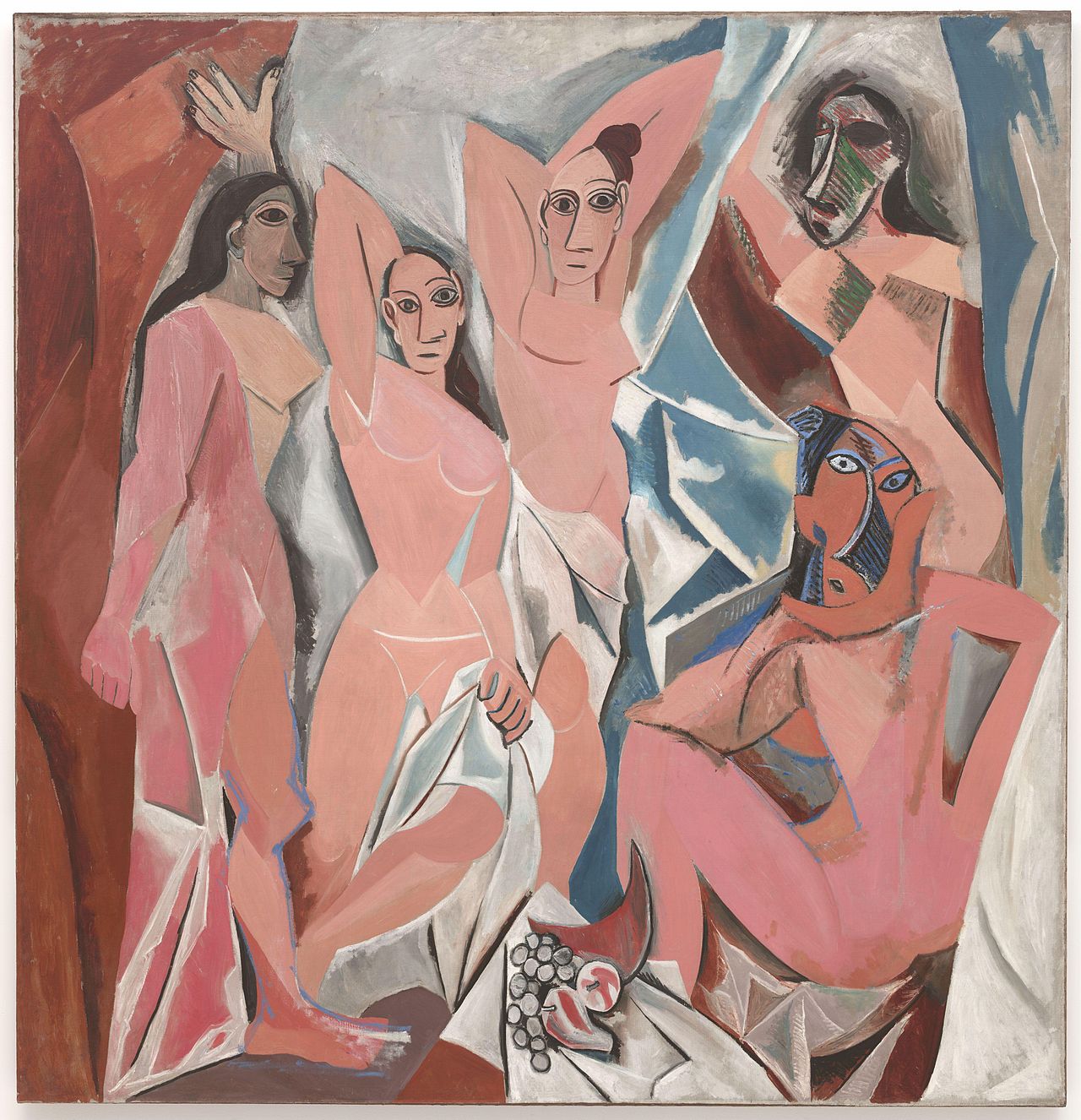
While the resulting piece is drastically changed from the original, my derivative work of art does share common elements to its predecessor. I incorporated a lot of the same shapes to create figures that would appear in roughly the same space of the piece, such as the woman entering from behind a curtain and the seated figure with the head on the hand. You may also notice that values were influenced by Picasso's cubist shapes. Where he may have used distinctive lines to cut through a figure and create a new form, I tried to mimic those lines with a value change.

One of the elements that is very different is the color scheme. I've incorporated much brighter colors (oranges and yellows) as well as a wider spectrum (purples and greens) as opposed to Picasso's muted/analogous red scheme. I also refined the movement of the piece, utilizing line to direct the viewer's eye to a focal point (the golden cup). The addition of this element, as well as the stylization of the feminine figures, also changes the mood from a somber, confrontational piece to a light-hearted, fun work. I'm rather proud of the execution of this project. Given more time, I'd work on really blending those colors and pushing the contrast to increase the sense of depth for each figure.

Saturday, September 12, 2015

Work In Progress: Pre-Production Layout and Reference Imagery

Concept Layout
The basic idea is to turn the les Demoiselles d'Avignon into mythical creatures surrounding an artifact. 
Reference Imagery
I sourced images from the internet to inspire and inform the piece. The plan is to copy the forms and textures to give the final product a better render.


Here is the digital composition that I am planning on rendering in colored pencil.

Objective Critique

Les Demoiselles d'Avignon is a proto-Cubist representation of female figures using warm muted tones against a cooler blue background. The analogous color scheme creates a sense of balance in the piece, causing all of the figures to appear on the same plane. A lot of this was accomplished by the Cubist style, which is a way of looking at an object from multiple points of view simultaneously (rather than one fixed perspective). This can be seen through the use of sharp, angular lines to denote the shapes of each figure. For example, look at the core of the woman with opening the curtain; you will see how the breast is differentiated from the ribcage, which is separated from the stomach with a stark change in color.

Shapes are also used to create contrast between the women, which imbues the piece with a deeper meaning. Looking at the women in the center, the face shapes are fairly symmetrical. We are able to identify features from the representative, simple eyes, nose, and mouth, and ear shapes, and recognize them as people. In contrast, the women on the right have faces that are more freely formed and fit less within the confines of representational art. Though some may find this offensive, this difference in depiction does a wonderful job of representing physical variations while evoking cultural differences.


Several elements also play a part in keeping this scene visually intriguing, especially with regards to the 'fluid-perspective' of cubism. There is little difference in value, so shapes do not take on 3D form. Space surrounds each of the forms, but is filled by fairly flat shapes. There is little separation of these figures from the background, giving the viewers a sense that they appear on the same plane. Specifically, look at how dark the shadows of the women on the left are, and yet how the forms overlap. The darkest shadow is cast be the woman who is farthest left, yet she is in front of the woman on her right, who should have a darker cast shadow against the light background. Then, the sheet covers the pelvis of the third woman, so she should be farther in the background, but there is no real sense of depth.

All of these elements combine to create an effective piece that rails against the formal traditions of what had previously been considered high art. Picasso used simple shapes, sharp lines, and analogous colors to make this work unique. 

Friday, September 11, 2015

Subjective Critique

At a glance, this painting does not strike me as aesthetically pleasing. Given the translated title "The Young Ladies of Avignon," I understand that I'm supposed to recognize female figures in a location that is presumably Avignon. Instead, I am confronted with garish caricatures of humanoid beings with exaggerated curves on a disjointed background. While I can appreciate what the artist was trying to accomplish, I don't like the style that was used to convey the message.


By using a Cubist style to represent these women, the figures lose some of their humanity by becoming flat and undifferentiated. The bodies are emphasized in a way that is not proportionate to real people, but does not seem to accentuate the figures in any meaningful way, other than depicting a "wasp" waist. The limited variation of value within each form makes them appear very flat, as though they were drawn on a cave wall (see Figure 1). I also find that the sharp, angled lines of blue with white highlights add extra movement to the scene that is distracting (Figure 2). Additionally, there does not seem to be a sense of unity within the scene. Engulfed in some sort of red and white circus tent, the women stand awkwardly in front of a low table that has a cornucopia of fruit on it. Other than being mostly nude women, there aren't many shapes that tie the piece together. Even within the bodies there are strange variations: some breasts are curved, others are very angular.

Figure 1

Figure 2 

I think that with a few tweaks, this work of art could be something worth marveling over. First of all, I'd focus on the form and proportions of the figures, using references to keep them true to life. By applying better value and contrast, I think that each figure would have more depth, making them more relatable to the viewer. I'd also unify the piece by incorporating the figures into a digestible scene. By placing them in a setting that helps to establish the difference of mid/fore/background, the figures in this painting would really stand out as the focus. To add a bit of visual intrigue, I'd toy with different textures, further distinguishing the art from a painting on a cavern wall. I don't even think this work needs to focus on human women to be interesting. I think I could do a better job of incorporating the shapes into a new composition by relying on gesture to evoke mythical beings. You'll be able to see some of the ideas I had based on the pre-production posted later on this blog.

Image and Basic Information


Les Demoiselles d'Avignon
By: Pablo Picasso
Oil on Canvas
1907